
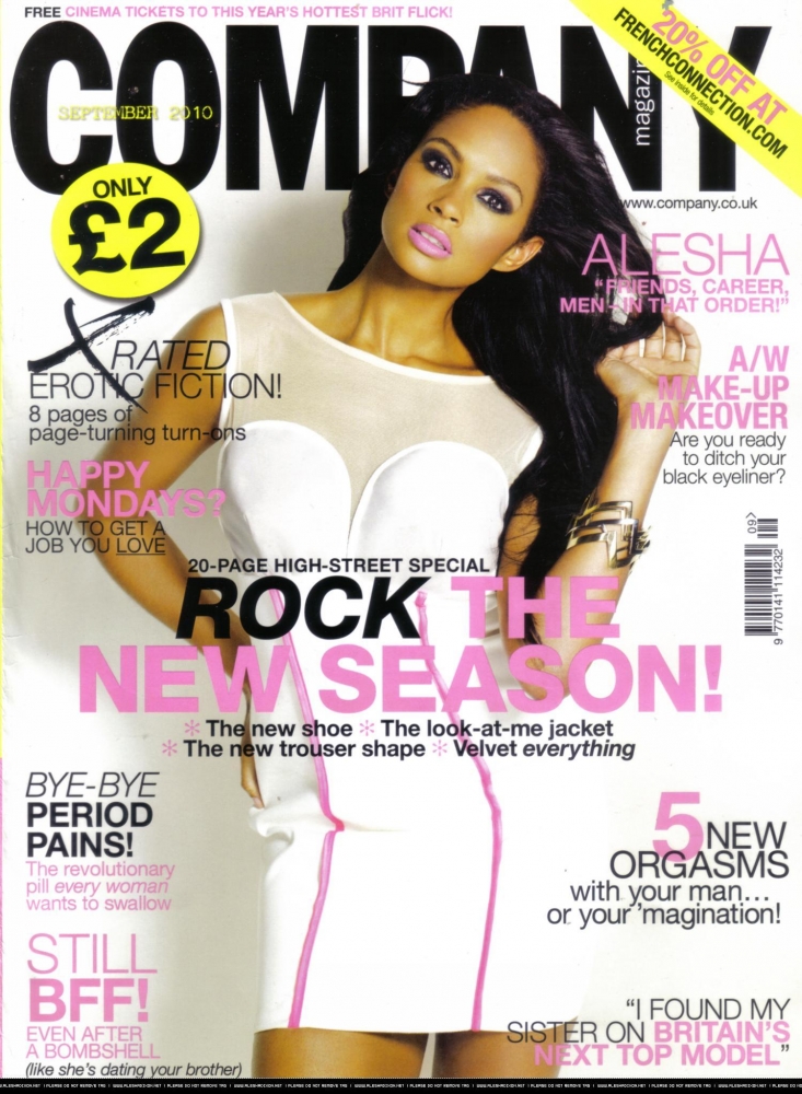
Both my cover and the Company cover have just one photo of a "famous" female on the cover. Both of these photos use direct address and have dress codes which fit in with the colour scheme of the magazine. Both photos stop around halfway down the female’s legs. However, the Company picture uses a more serious pose/facial expression, whereas mine uses more friendly gesture codes for example smiling/natural facial expression.
The text/writing for both covers uses a range of colours which all compliment each other. Company uses a wider range of sizes however, and over all smaller fonts.
The layout for my cover and the Company cover are very similar. The photo of the female is at the centre of the page, the top of it partly covering the title which is placed at the top of the page. The main text (article titles etc) is placed at the sides of the cover. One thing the Company cover has done that I have not is to put the main story at the centre of the page in a much larger font. Another thing I found was that Company had a small banner at the bottom of the page; this was the same colour as the title. My magazine also does this.
Both my cover and Company appeal to the target audience (young females) by using typical feminine colours, with relevant language (hot, slated etc.) and stories (fashion). The image of the female also uses direct address to make the audience feel as if the famous person is urging them to buy the product. The use of a celebrity itself also appeals to the target audience. Both images are also of females within the age of the target audience.
My cover is conventional, like the Company cover, as it is cluttered, showing many features in the magazine to fill it with lots of text. The main picture of a female being central and covering the title is also very conventional. This is the same for the title being in a simple text, spanning the top of the page. The use of a circle with a colour that stands out to show the price or a main appealing feature is conventional to the type of magazine also.
Cosmopolitan Double Page Article “Step into your dream job” Comparison:
My article contained a variety of photos. 3 of these were of a female model, 2 long shots and 1 mid shot. There were photos of bags and clothes cut out separately without a person modelling them too, these were all taken facing head on. All these were relatively small on the page, excluding one main photo of the model spanning the right hand side of the left page. The Cosmopolitan article used one large main photo of many girls’ legs, dressed smartly, to the top left of the page. This was a long shot. There were also a few smaller photos of bags cut out and placed to the bottom right of the page.
All the text was black, apart from a section of my title which was red, as well as another section of my title being in bold. The text was ranged in size, small text for the main article, smaller for added info (contact details) and large sized for the title. For cosmopolitan there is a lot more text, including an introduction. The text is very small bar the main title and a few sub-headings. There are also heading at the top of each paragraph in pink, adding to the bright colours of the page. The title itself is also in white, with some use of pink and yellow for heading in separate sections of the page.
The layout of my double page has the title at the top left of the left page, with text split into boxers around the centre/to the sides of the pages. Photos fit around the text, which is in a column. Cosmopolitan’s title is to the left centre of the left page on top of the main image. The text is in columns, split up by brightly coloured headings. A heading referring to the magazine is in a bright pink circle at the top left of the left page: Cosmo’s cash and careers clinic. Some text is separated into boxes spread about the page.
Audience appeal is achieved by both with the use of photos that link with the audience: young females. They also both use bright colours, a good mix of images and text as well as relevant issues. The text is also split up, placed into boxes in mine, and different coloured heading ands boxes in Cosmo. Unlike mine, Cosmo’s main image also uses a cute dog in the background which appeals to females.
Conventions that have been followed by both articles are page numbers at the bottom of pages, large titles near to the top left, a good mix of text and images and bright colours. Cosmo also follows convention by having lots of content on the page, with little of the background showing.
No comments:
Post a Comment