
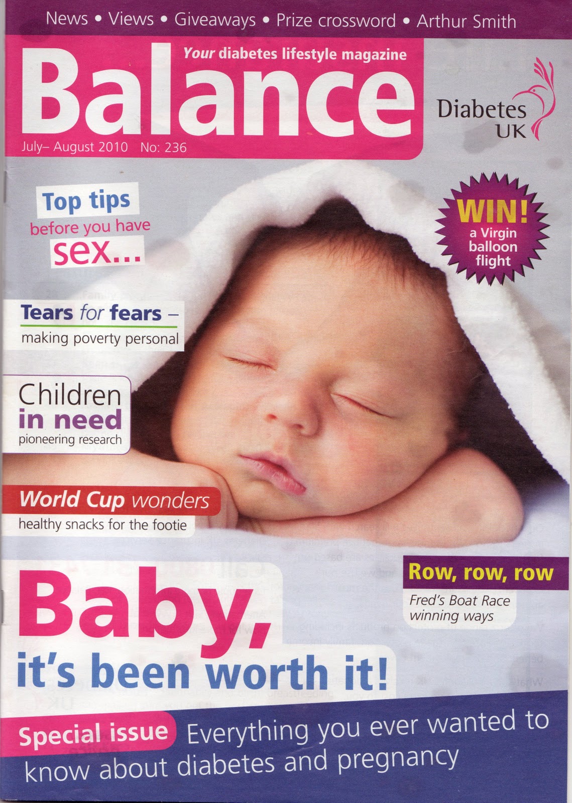
This cover had one main picture as the whole background.
Pink, yellow and purple colour scheme.
Text a mixture of capitals and lower case. Yellow, pink, purple or white.
Pink, purple and white colour scheme.
Banner at the top of the page with text. Green colour makes the banner stand out.
Purple circle with white outline for appealing information.
One main picture as the whole background.
Pink, purple and white colour scheme.
Text mainly white on pink or purple or white. Many colours to make each section stand out.
Title situated in top left. White against bright pink rectangle, stands out.
Banners at the top and bottom of the page with text.
Purple circle with white outline for appealing information.

Diabetic Magazine: Diabetes Forecast
One main picture as the whole background, image of a natural woman.
Red yellow and blue text
Title situated in the centre and top of the page. Title covers over image of woman.
One blue banner at the top of the page with white and blue text, highlights one of the main stories.
Diabetic terminology frequently used.
Teenage/young adult Magazines: Teen Vogue, Mariclaire and Cosmopolitan.

Title at top centre of page.
Image merges into text, with text placed over the top of the girl.
Main photo as background, blurred plain background of photo has the same effect commonly used white backgrounds, making the woman stand out.
Text colours are mainly pink, also use of red, yellow, and black.
Yellow star used to highlight key information.
Outfit of woman compliments the colour scheme of page.
Date at top right of page.
Mix of capitals and lower case throughout.


Summary:
The diabetic magazines all contained banners to show key elements of what the magazine included, there was also a very wide variety of colour schemes and text colours between that magazines, though either blues, pinks or both were used in each of them. The title was usually at the top left of the page, and fitted around the main image. However the last followed a style more like the teen/young adult magazines and was in the centre, fitting into the image. Mixing the two styles is something I will need to try to do in my magazine cover. The main image was always used for the whole background of the page. Some of the magazines also included diabetic terminology, and stories would always relate to diabetes.
The teen/young adult magazines had a variety of colour schemes. The headings and title would usually be within these colours, with black or white text for less important information or descriptions. Pink was a popular colour, and the other colours chosen would contrast well such as red or purple. The title was always at the top centre of the page and overlapped with the image of a woman. The same style of image was always used, and the woman's clothes always matched the colour scheme. The background of the magazines were always white. A date and price was situated at the top, with bar codes at the bottom.
Almost all the magazines, from both genres, included the use of a circle or star, usually a colour that was not included in the colour scheme to stand out. The circle was used to draw attention to appealing information, usually to do with money, for example sales in shops or the cheap price of the magazine.
No comments:
Post a Comment