My media product was a magazine diabetic magazine. The audience for this would be females, aged 16-35. These females would be diabetic, or have a close diabetic family member. They would already buy teen/young adult magazines and would have interests in fashion, gossip/news, advice/style tips. These were shown to be the most popular amoung my target audience in my questionnaire. This would make them stereotypically feminine, as well as health and appearance conscious. They would be middle-upper class and modern, making them interested in keeping up with the latest new, technology etc. Due to the unique target audience (in my research I found most diabetic magazines have much older audiences) the magazine was a mergence between female teen and young adult magazines, as well as diabetic magazines. This meant only the most appropriate conventions and features from each were included.
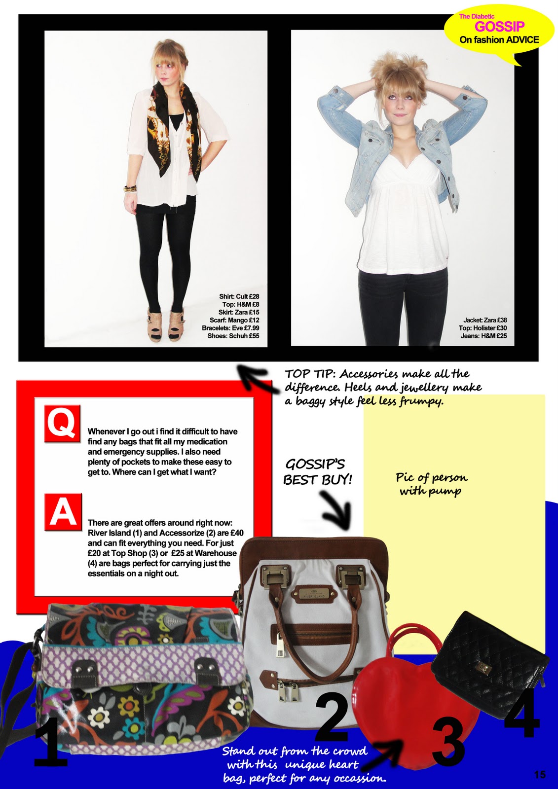
On top of this the article also followed conventions of a fashion article, due to its fashion related topic. These conventions included the use of many pictures, with reference to the shop and price. Also the mixture of items cut away from their original background and numbered, as well as photos of a female against a white background with a list of the items in the photo with the shop and price. In addition my article uses font and arrows which create an effect that appears like they have been drawn on; this is often used in fashion pieces.
My cover consisted of a white background with one main picture of a young female celebrity at the centre, overlapping with the title. This layout challenged the expectations of diabetic magazine covers (one picture for the whole background) but was conventional to teen/young adult magazines. The cover also had lots of text, and included vocabulary such as “hot” and “slated. This again fitted conventions for teen/young adult magazines, while challenging diabetic magazine conventions. However, conventional diabetic magazine language was also used such as “blood testers”. Finally the issue number, date, the use of different colours for each section of text, the inclusion of a banner and finally the use of a circular shape including appealing information (in this case the price) were all conventional to both types of magazines.
The double page spread incorporated images of young females, conventional to images seen throughout teen/young adult magazines. A speech bubble was also used at the top right corner of the right page to state the magazines name, this is also conventional. However every magazine chooses to display their name differently, e.g. in a star. The bulk of the text was written in black, and split into columns where appropriate. This is conventional to the way almost any magazine’s text is presented. Cohesion is conventional to any double page spread. I created this through the use of my blue wave at the bottom of my article, and by using red and blue as my main colours throughout. Finally diabetic topics and language was used to keep the article relevant and appropriate, fitting the diabetic magazine conventions, while challenging expectation of normal teen/young adult magazines.


It was important to mainly stick to the teen/young adult magazine conventions to allow the text to appeal to the target audience by appearing as close to the similar product they often buy. The free hand arrows also related to the way young females annotate and doodle. However, incorporating some key diabetic magazine conventions was needed to clearly show the magazine was for diabetics and appeal to them. On my cover the celebrity female’s direct address pulled the audience in by connoting her support for the magazine, and that she wanted her fans to buy it. The direct address in the photos of the model and the writer in the article created a relationship between them and the audience. This was especially essential for the writer as she is an “agony aunt” and would be trusted with the audience’s worries and problems.
My product represented young females, mainly in a stereotypical way. Firstly the cover shows features such as “Fashion advice special” and “Hot new recipes that won’t pile on the calories”. This connotes young females as highly appearance conscious as one of their main interests is how to look good. This incorporates the male gaze theory as the models in the article are made to appear attractive to the males, and the audience will feel pressured to do the same. Through articles such as the recipe article, and the rating of blood tester young females are also connoted as health conscious. This represents them as responsible and mature. However, these self conscious attributes also connote young females as vulnerable and an easy target for the hypodermic injection theory. This is reinforced by articles such as “Fashion advice special”. This connotes that young females seek advice from the media, presenting them as a passive audience. However, the bright colours for the text on the cover, the bright colour theme of the article and the bright dress codes connote young females as fun, outgoing and confident. This is reinforced by the model’s gesture codes such as smiling, and open arms.
The article and some of its pictures followed a narrative. The Equilibrium occurs before the female has become diabetic and found the disruptions the condition brings to life. The article was based around the disruption of a person’s diabetes creating problems in everyday life (bags to fit medication etc). This is shown through the photo of a girl struggling with her pump due to a tight top. The recognition begins when the female writes to the magazine for advice, represented through the question section in the article. The attempt to repair the disruption is demonstrated through the answer section of the article, where the agony aunt writes advice. Finally the reinstatement of the equilibrium occurs when the female uses the advice, illustrated through the three images of the blonde female in fashionable and comfortable clothes. Direct address connotes her newly gained confidence due to this.
The institute that would be likely to distribute my magazine would be Conde Nast. They are very successful and distribute a wide variety of magazines, including teen/young adult magazines such as Glamour, and teen Vogue. They also distribute technology magazines like Wired, food magazines such as Bon Appétit, and lifestyle/home magazines, for example Easy Living. All these categories relate directly to my magazine. Not only this, but due to its success it would be an ideal company to take on a completely new type of product for the industry.
The software I used was Adobe Photoshop CS4. I have constantly learnt new tools and techniques, and improved all my skills. For example I learnt I could cut away images from their background more efficiently with the magnetic tool and gained greater control of the mouse by drawing the arrows and circles free hand. I also learnt how to create a wave at the bottom of the page and experimented with tools such as the red eye tool to create better quality photos and the clone tool to get rid of obvious spots and blemishes. In addition, I used a photography camera to take the photos and put into practice all the types of angles and shots I had learnt in the course. However, I believe an even wider range of shots would have been more interesting and effective. Finally I used a site to create a questionnaire that could then turn this data into pie charts, bar charts etc. However I came across problems as many of the people had answered incorrectly (I only sent out to females yet some put they were males etc.). Instead I had to discount the invalid questionnaires I had received and create a table myself. To improve I would have redone the questionnaire so I could use the software to produce more effective and sophisticated charts.
Through my background research I have learnt detailed conventions of diabetic and female teen/young adult magazines, as well as fashion articles. I have also learnt how the size and positioning of something can change the effect it has, as well as the page’s effect as a whole. I have also discovered the difference between designing two separate pages, and designing a double page article, and the importance of the use of cohesion. House styles are also key, and I have now begun to notice how different magazines create this, and how I could create this for my own piece.
I have constantly learnt how to improve my magazines overall appearance and effect, but there are still further improvements. The F in “Fashion Advice Special” on the cover was very hard to see against the models top from a distance. Although this would have been read up close, it would still have been better to have the texts colour much darker. Another improvement would be to create more cohesion between the article’s pages. This could have been achieved having more text or images spread across both pages. I would have also liked to link the article further to the magazine. I noticed some magazines included the magazine name or website by the page numbers, I believe this would have been very effective in my piece. It would also have been good use more white text against the darker background to make the text stand out more.